makr
A bold mark & visual identity for a bespoke interior design + architecture firm specializing in multi-family residential interiors.
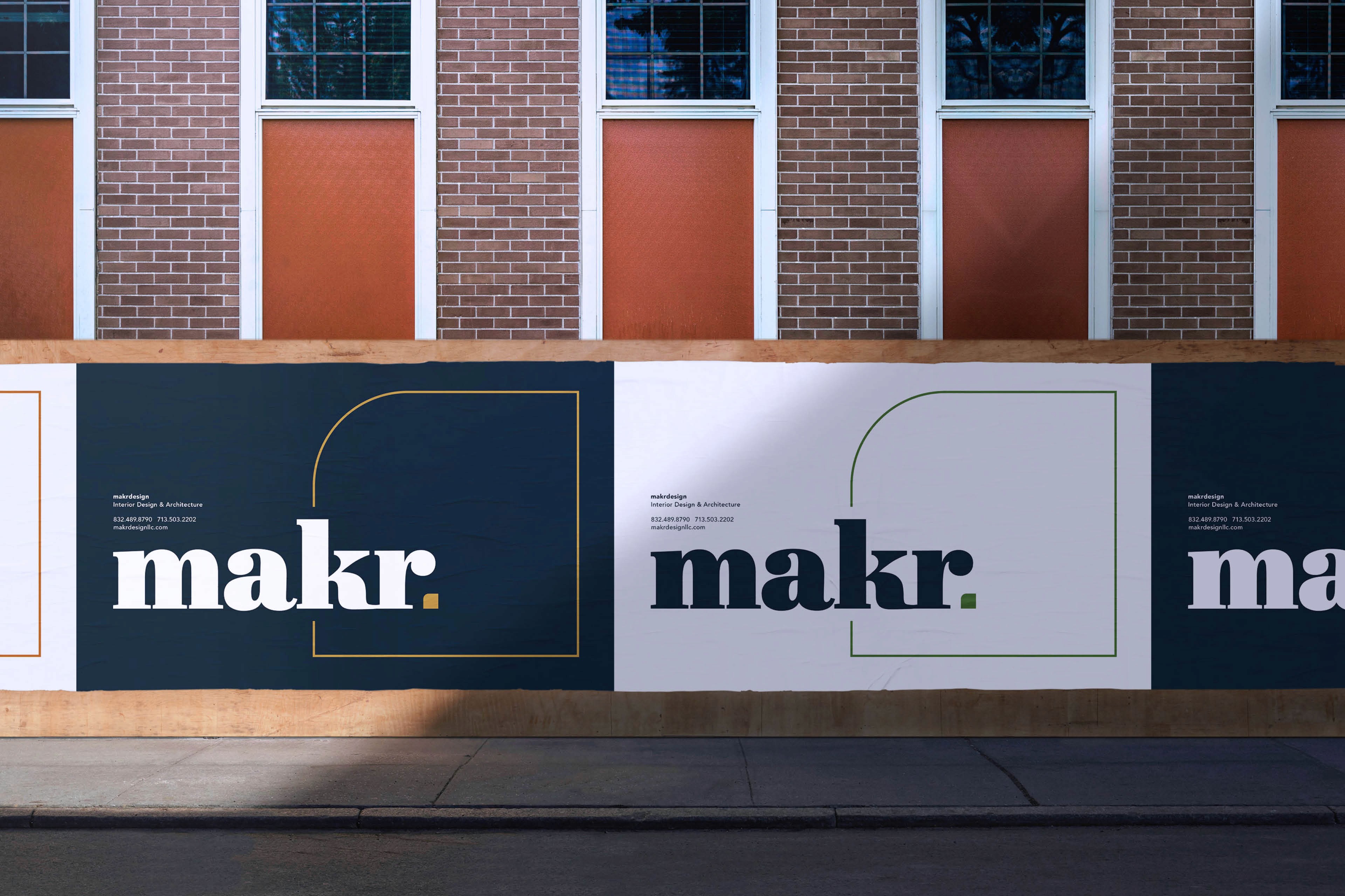
Mark plus Kara equals:
a new perspective.
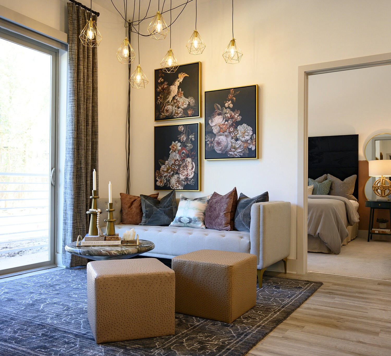
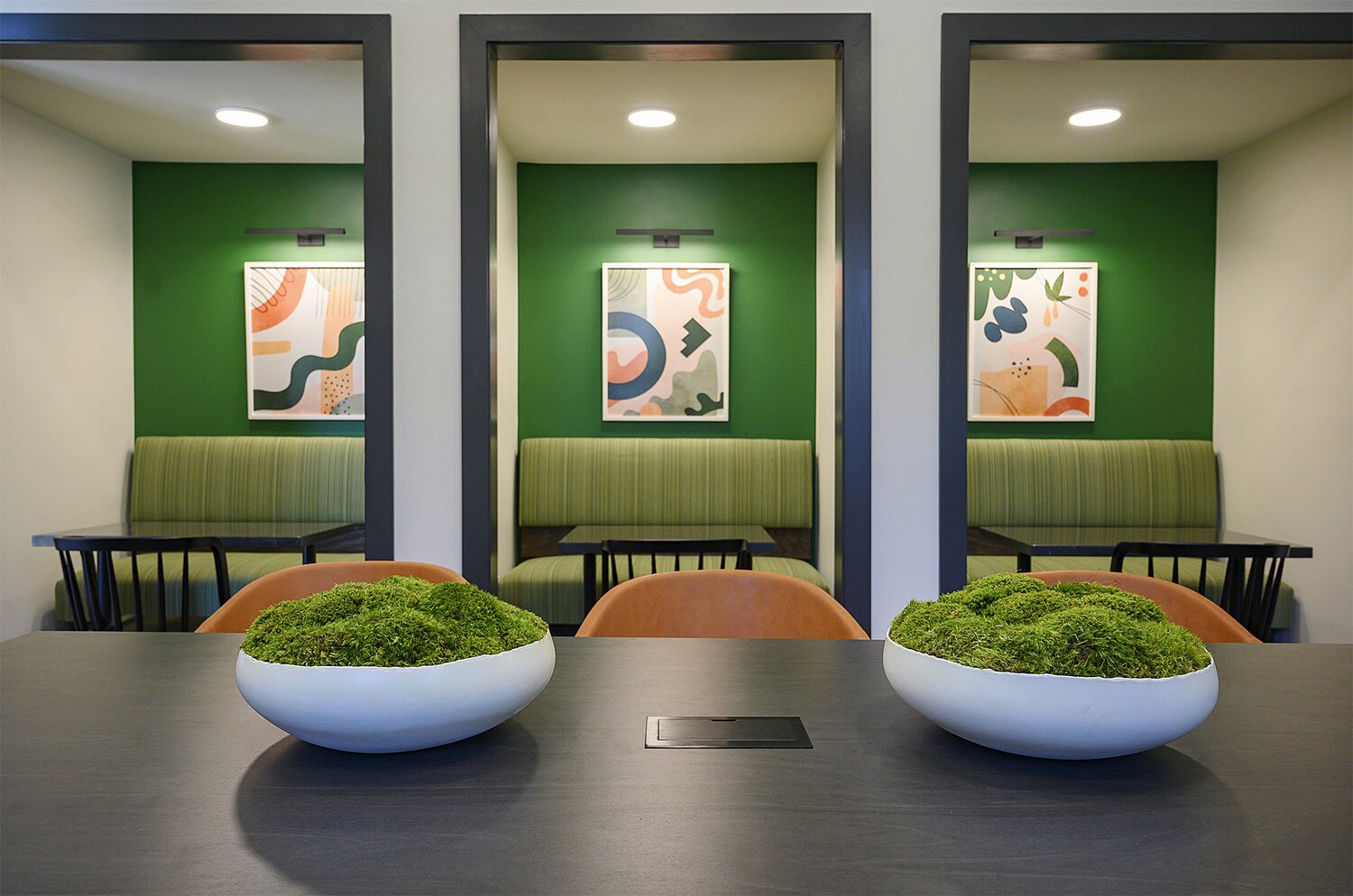
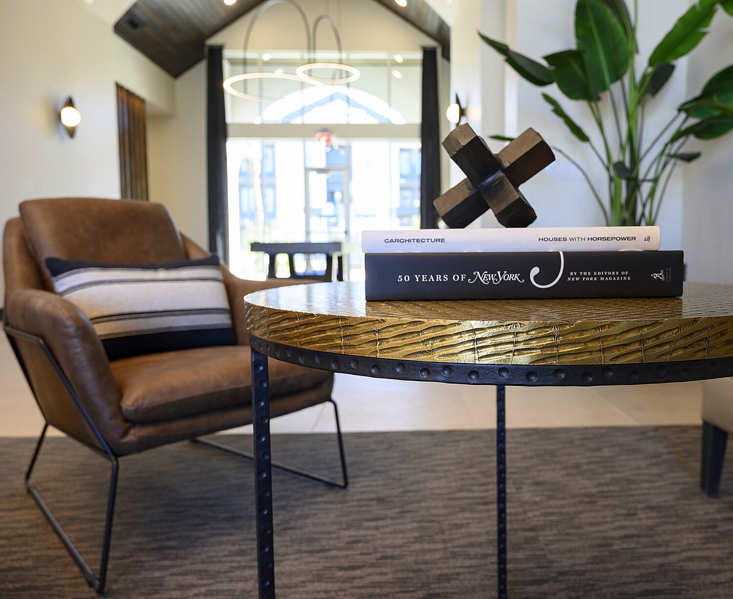
Mark & Kara, the founders of Makrdesign (now makr, a combination of both of their names) needed a new look to drive their company forward in regards to their little niche of the interior design industry. We found that visualizing the combination of solid foundations & bespoke nimbleness did the trick.

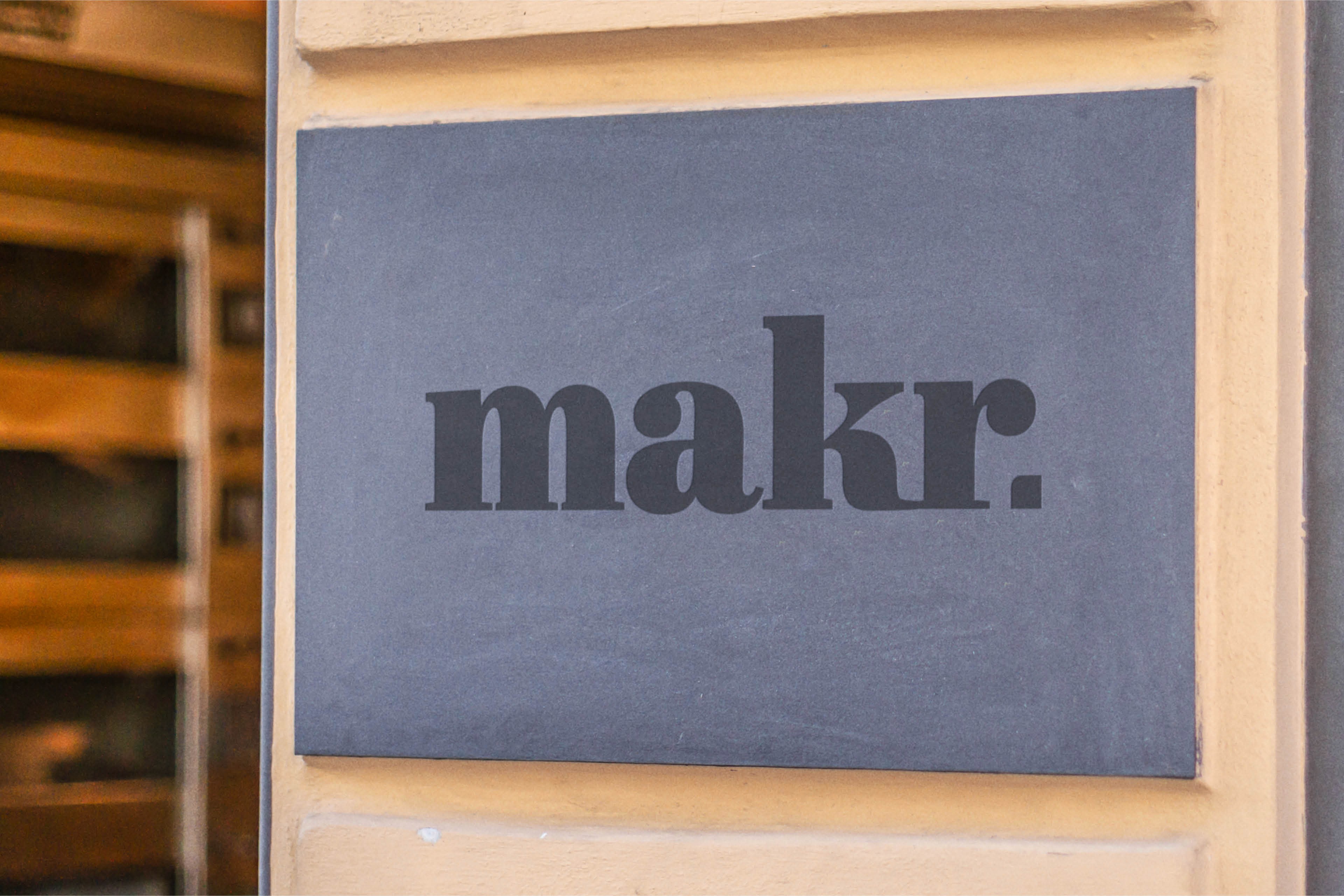
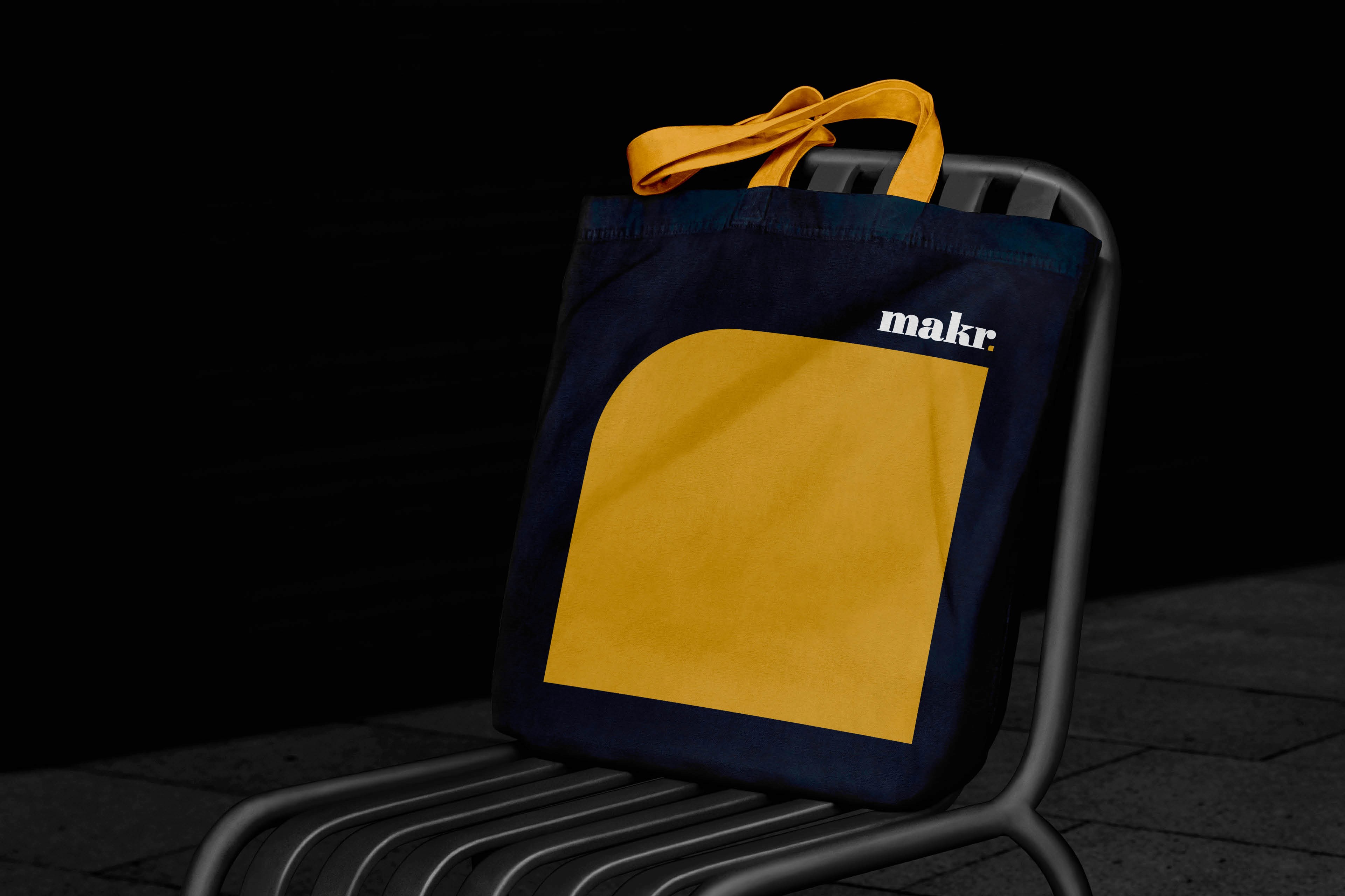
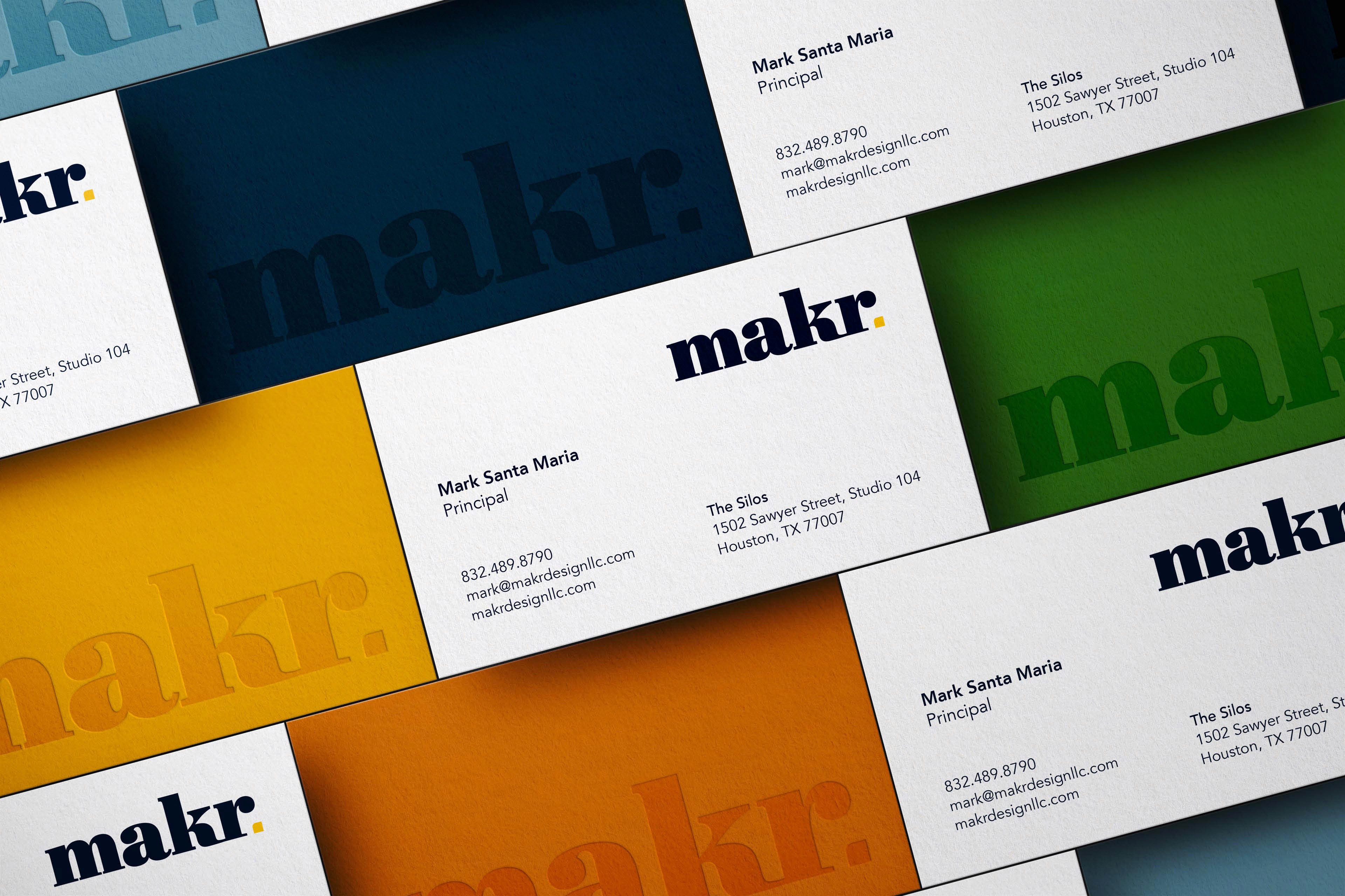
While developing this solution for the folks at Makr, we decided on a typographic mark with a dynamic, color changing full stop. The attitude of the bold serif type choice and the combination of a everchanging graphic element gives MAKR a visual language that speaks to their forthright attitude and a tailored-to-you design approach.